Sunday, November 25, 2007

Frisbee flier

I made this flier for RMIT Vietnam Ultimate Frisbee Tournament (it's such a long name for one sport competition T___T ) .Uhm, for this flier, I want to change my normal style (my friend told it's cartoonist T__T), so my purpose is to make this flier quite attractive and different to my normal design.

Then, I came up with the idea using photography. I found one free and un-copyrighted image in the Internet. The picture's angle is pretty good, so my job was mostly playing with typography.

Because of the length of the competition's name, so I choose two words from the name as the main elements, which are RMIT and Tournament.To attract viewers' view, the other characters are dimmed and only one T is used to link two words "RMIT" and "Tournament"


I align the text at corner left as it's the direction of man's eye view and the disc.Also, I applied some effects (overlay one white layer and duplicate some necessary layer ) to clear the text.

Because the flier is printed in black and white, so I change the color mode of the picture into grayscale.


Updated version ...

web layout

This is the web layout I design for my first assignment in the Web programming course.The main idea is simple and clear; therefore I use monochromatic of red as the dominance. Difference hues of red are used for different part of web layout.

Besides that, I like the idea of gathering small images to make up big image, so I applied this idea to the "welcome page". Also, I remembered Maddy said:"if viewer can see easily, it's not funny."; consequently the middle part of "Vietnamese Dating" phrase is dim. It properly engage the concentration from viewers..

Welcome page ...


Home page ...


Sunday, November 18, 2007

Pride ...

I have 2 version for the idea "A wound to one pride", one of this is came from the lesson Collage of Maddy. However, I have just made one version for my idea, the "collage" version will be come later (because of the lack of equipment now).


Making progress:

1. I took the picture of my bear.
2. Add text to it

Could you realize the mask of Dark Vader? why is Dark Vader? If you've ever watched STAR WARS, you know Dark Vader is a powerful man, he is the lord of Dark side. Consequently, he has a absolute pride. However, when the mask is taken away, Dark Vader no longer is a Dark Vader. There is a wound to his pride, and what he feels when it's taken away is almost like his body is broken. There is a metaphor here, the physical and moral hurt : physical hurt is the leg is taken and moral one is his pride. Red text attracts viewer eyes and also put a strength for itself. The "Pride" letter is bold to become the dominance for the whole picture.Two letters "my" and "PRIDE" stick each other to reveal the close link between the pride and human mind.

Photoshop Practice ...

Photo Sharing and Video Hosting at Photobucket

The last class, I have a good lesson to experience how to using Photoshop for picture manipulation.I did many versions for the exercise; however, the stupid computer at school suddenly shut down while I hadn't save my picture to H drive T______T . Therefore, I just keep only one version of the "Eye" picture. However, I really love the picture ^_^ . I haven't remember much how I made it, but there is still something I want to mention :

1.main color is green which is support by yellow in some parts of the picture.Green and Yellow provide a good harmony, also they give a magical feeling. The whole background is applied cloud filter in order to offer an feeling unpredictable.

2. The black at the right corner express shadow from one guy's face, also it make the background seems similarly an old paper.

3. I used a handwriting brush which make the background more like the old paper.

I try to make my picture seem to be an eye looking through one paper. It doesn't dedicatedly scare people, but make people feel curious when looking at it.

Sunday, November 11, 2007

Stolen

I found a pretty pic from flikr; however, I'm not sure whether the picture is copyright or not.So I put the credit here :

"broken plank on ladder" picture - Upload on October 9th, 2005 by maleeha.azeem
http://www.flickr.com/photo_zoom.gne?id=50731955&size=o

and my "stealing" pic

Photo Sharing and Video Hosting at Photobucket

My idea is :

1. In Vietnamese culture, we have a perception about ladder :"Nấc thang cuộc đời" ( the ladder of life"). The ladder is broken, which means one part of life has been taken away.

2. The bottom known as a basic part of everything, if the bottom is not firm, it immediately impacts the development later. The ladder here is lose its part in the bottom; therefore if the beginning has been "steal", there is no doubt for one un-bright future.

3. For some people, Yellow provides a sad feeling. Yellow which is the color of autumn leaves, sunset, color of "the ending" period. In addition, yellow offers a good contrast to the background (which is blue) .So I applied yellow in my text, also make it a little blur. Blur reveals a shaky for the text and the ladder in picture.

Friday, November 9, 2007

HAT Tournament Logo ....

Again, I received one short time contract T____T (it is perhaps an one-day contract). This time, the contract requires me to design one logo for HAT Tournament held in Vietnam. It's quite funny that I don't know much information about this tournament. All I know is that the tournament is a Frisbee competition and it has been hold annually in Vietnam for 2 years. So what should I do to deal with this contact?

1. I searched in the Internet some example of sport logo. I realized mostly the logo is abstracted in player's image.

2. Experience in my previous design, gradient and color should be care in using.

Finally, I decide to keep letter "H" and "T" simple, and decorate a little bit in letter "A". I choose the image of one player pull the Frisbee disc (which always occurs at the start of one new point). My personally thinking about this action is that it express the passion and spirit of each team when they start fighting in one "battle" ^^

Photo Sharing and Video Hosting at Photobucket

Uhm, my personal comments for my all work are:

1. If the logo is put on the shirt, I think it's ok because it's almost filled by white color and the logo worth a small space in the shirt. However, if the logo placed in the disc surface, it provides a big negative space. Therefore, I suggest one circle around the disc in order to decrease the negative space.

2. The font for "H" and "T" is not good, it contains curve which decrease the attraction of viewer in decorative "A". I'm trying to find one suitable font. Uhm, I think a serif which doesn't contain curve, but straight line and square is an appropriate solution.

Friday, November 2, 2007

Sun & Moon Icon ...

Draft versions

1."Polygon" Sun


Photo Sharing and Video Hosting at Photobucket

I read the legend about Ra (the God of Sun in Ancient Egypt) who create all things on the Earth. Therefore, I came up with an idea, Sun could be present by basic elements : triangle, rectangle,circle and one more shape which represents the cloud.


2."Musical" Sun

Photo Sharing and Video Hosting at Photobucket

As be known from Greek Legend, Apollo, the God Sun, is also the God of poetry and music. His symbol is lyre, an musical instrument, and he's excellent in playing it. Consequently, I used his symbol and some abstract musical note in order to express the "Musical" Sun.

3."Camera" Sun & Moon

Photo Sharing and Video Hosting at Photobucket

It contains Sun and Moon. As Maddy said in class, the client of me is an photographer, so he must use one camera to take pictures.Then my idea was based on the lens of camera, which is the most important equipment for the photographer. Lens has bevel gears for user to control; in my opinion, those gears is similar to the light surrounding the sun. And when the lens is covered, it is completely a circle which is the real shape of Moon. However, I did add more details in Moon side; especially the background for Moon icon, I put some lozenge which represents stars in night sky.

4."Ying Yang" Sun & Moon

Photo Sharing and Video Hosting at Photobucket

In Chinese tradition, Ying Yang is the symbol which present two element different but can't live without each other. Similar to Sun and Moon, they have the connection between those two elements. One is dark, but soft and charm; the other is bright, strong and power. They support each other. That's is the idea for my 4th icon.

5."Human Eye" Sun & Moon

Photo Sharing and Video Hosting at Photobucket

This icon I like the most (perhaps I choose it to illustrate in Illustrator later), the human eye which consist Sun and Moon. The most attractive part in human eye is the iris, and when we look at it deeply, we can find some tiny lines. Then I imaged those lines are the light surrounding the Sun, and if we ignore the details, we got a circle (again, it's the real shape of Moon). Another reason why I chose Human Eye structure to create Sun and Moon icon is eye is the first lens of one photographer ;) .Photographer have to use their eyes to choose the best angle and best view in order to capture one picture later by a man-made lens ^^ .

---------------------------------------------------------------------

Illustration versions are upcoming ...

Thursday, November 1, 2007

Printing Experience ...

This week, I accepted to design flier and poster for Frisbee Club in order to use them in Club Day.

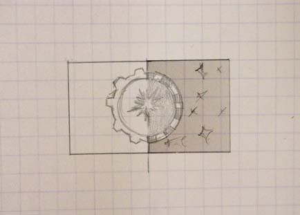
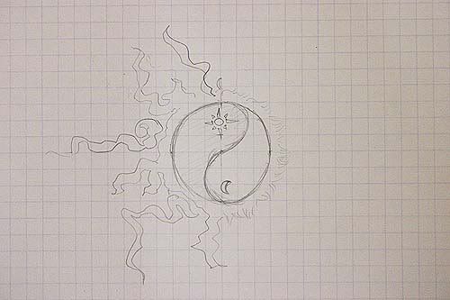
As be mentioned in the previous blog entry, the final flier contains two sides, these following pictures will show how the flier looks:


The poster was already posted in the last entry.However, the design of this poster is not what I want to mention. This entry is a chance for me to share my own experience in printing.

First of all, before starting design the poster, I asked my friend :"should I make a colored or black&white poster?" and the answer I received is:" If it's the first time of you, black and white is an appropriate solution". Personally, I thought black and white are two color which is easily printed. But, that was my fault T_______T , let see what I got for the poster:

Photo Sharing and Video Hosting at Photobucket

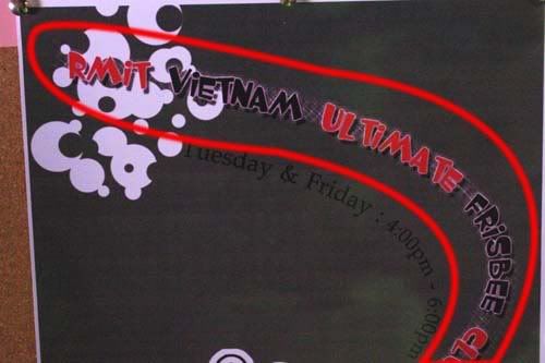
1. The gradient from black to white is not present accurately. As can be seen, it was changed to a color (in my opinion, it is light purple). And over th poster, I notice wherever the gradient is applied; especially in a small place; the color is presented less accurate.Briefly, the smaller the size of gradient (from back to white) is,the less accurate color presents .

2.I used to apply gradient for the whole background and lighten it.However, what I received is a half-tone background. As can be seen from the following picture (and also, from the above picture), the background seems to be divided in to small bars; and in each bar a gradient contained.

3. Because, I realized this trouble in color presentation almost after the poster printed, I asked the boss the reason. He said :" If you want a poster which is exactly the same to your original one; there is a printing method available for you". He called the method "in group" ("in" of "in ấn" in Vietnamese; I'm really sorry that I don't know what exactly this phrase in English), and it costs 150,000 VND ( 10 times of the price for the current printing method I used)

Photo Sharing and Video Hosting at Photobucket

So, I want to conclude that if you want to print one poster or any paper, there are several thing you should concern:

1.Color system: CMYK (as we learned), RGB (the manager can help you to change it, but there are many differences and you can't handle them completely). Usually the color printed is darker than the one you see on the screen.

2.Arrangement of element: when I went to the store, they just required me an Corel file (Illustrator is ok, but this application is not popular in Vietnam printing store) and they helped me in almost steps.

3. You should choose one familiar printing store, 'cos different store offers different type of printing method. Sometimes, although placing in the same street, there are some printing method which is not applied by all shops.

4. The store I printed the poster placed on Lý Thái Tổ street (it's very famous about offset printing and various types of printing), and the price is 15,000 VND.

5.If you are looking for printing poster with that price, try to use less gradient and be careful when using black >.< . It seems the hardest color to present.

6. I found one news, we can use offset print and the cost is 35,000 VND for one A3 size poster. Another solution is printing picture (as normal, I means "rửa ảnh"), but the price absolutely high and sometimes color is not produced accurately.