
This is actually my assignment 2C . Because I choose Playbill font, which is one of West Fonts, so all pictures added are related to American West in 19th Century
Assignment 2C
Sunday, December 30, 2007
Sunday, December 23, 2007
Safe Sex Poster ...
It's weekend and we're all suffering Java 1 assignment T___T. So, this blog is a little interest I can have from to day to Xmas ^^" .
This following picture is the poster of Safe Sex I made for Assignment 2B. Mytarget viewer in this poster is the homorsexual people, especially for the girl. During researching fro this assignment, I realized the lack of acknowledgement about decease tramissed through homorsex. That's why I did this poster
Slogan is emphasized on the word "Whoever", "Whoever" you are : men, women, and even your partner's gender. Condom is needed to protect you from danger.
One thing I'm afraid that the metaphor, maybe it's hard for some people to understand (some of my friends do, but other recognize the messages quite easily)
There is some trouble in color when I uploaded the CMYK version; therefore I change the color mode to RGB, which caused a little difference (in black color)

Saturday, December 22, 2007
DVD interface ...
X-mas is coming, so I choose to do the interface for "Love Actually" movie, which is my favorite film and also a well-known Christmas movie.
I use "Silent night" as the theme song to offer a calm feeling in Christmas.Moreover,the feeling of viewer after watching this movie is warm and happy, so Silent Night is an appropriate solution. I add some snow to provide better "Christmas atmosphere" (but it doesn't look good, maybe I'll fix it later)
Link Love Actually
Credit: poster Love Actually from www.loveactually.com
"Silent Night" song from www.freeplaymusic.com
Thank Raymond Dao for the code to embed Flash
Saturday, December 15, 2007
Collage ...

Here is my self portrait collage,there are several things I want to express through this image
1. The gesture of myself express my charactericstic: shyness and have a tendancy to protect my self.
2. The hands reveals my own identification: I look at the real world in my own way and I know what should I do to identify myself to others.
3. The background is made up by my name Chop and a sequence of numbers which is one of my hobby. I ussually remember one issue by assiging it one value; therefore, through the whole number sequence, many feelings are expressed.
4. I choose green color as the background because of two reason :
- that's my favourite color
- Green is the color of jealous and that's a potiental characteristic inside me.
5. The target at the left corner represents for my direction, I've got my own orient, so now I just target it .
Sunday, December 9, 2007
iPod ....
Well, I addict to iPod now ^o^ after watching several introduction videos of Apple products from youtube. Uhmmmm ... I hope I can get one iPod, but I don't have enough money now T___T , so I try to create one iPod by Photoshop :D . It's quite easy to make one "photoshop iPod" because of the simple (but very effective) design. Then, I suddenly think :"Why shouldn't I make an Ad for this product?", and so I make this poster ^^ .

Another version with a little bit different ^^

I'm not sure what accurately this iPod is :D, maybe it's a 3rd generation iPod Nano. Whatever it is, let me explain why I make the design in this way ^^ .
I choose blue as the color of the iPod to offer a calm feeling for viewer, also the iPod body has to be dimmed so that the screen can engage the attention from people. To emphasize this point, I use red as the dominant color of the screen, red is quite hot and attractive enough. Also, this color supports to the action of the woman on the screen, she tries to break the iron bar of the jail.One more reason to use red is that red and blue combination provide a good contrast.I think you all can easily recognize the screen is absolutely made in iPod advertising style :D.
Now, let's look at the text.As the main concept in every Apple ad is simple but efficient; therefore, I chose a clear sans-serif font and apply the "theory" I learned from my friend's blog (Charter's blog ^^). To stress on the word iPod, its size dominates the other ones, and it's dropped shadow and impacted by glossy effect (which becomes a characteristic in Apple design).
I choose the slogan :"let iPod set you free" which is inspired from common perception :music make people feel free.
Credit: Woman's picture is taken from http://greensboring.com/viewtopic.php?f=23&t=6508


Another version with a little bit different ^^

I'm not sure what accurately this iPod is :D, maybe it's a 3rd generation iPod Nano. Whatever it is, let me explain why I make the design in this way ^^ .
I choose blue as the color of the iPod to offer a calm feeling for viewer, also the iPod body has to be dimmed so that the screen can engage the attention from people. To emphasize this point, I use red as the dominant color of the screen, red is quite hot and attractive enough. Also, this color supports to the action of the woman on the screen, she tries to break the iron bar of the jail.One more reason to use red is that red and blue combination provide a good contrast.I think you all can easily recognize the screen is absolutely made in iPod advertising style :D.
Now, let's look at the text.As the main concept in every Apple ad is simple but efficient; therefore, I chose a clear sans-serif font and apply the "theory" I learned from my friend's blog (Charter's blog ^^). To stress on the word iPod, its size dominates the other ones, and it's dropped shadow and impacted by glossy effect (which becomes a characteristic in Apple design).
I choose the slogan :"let iPod set you free" which is inspired from common perception :music make people feel free.
Credit: Woman's picture is taken from

Wednesday, December 5, 2007
Collage portrait ....

Yeah, this is the first portrait collage picture I made. Well, it looks quite messy, I think. However, let me tell my idea for this picture:
1. The girl has two type faces, one is made by photography, whereas the other seems to be sketched by hand. The reason why I do this is to represent the "mask" existing in everyone. Everyone try to create a mask for themselves in order to hide their true feeling. And the "drawing" half face reveals this stuff; otherwise the other expresses something related to nature and organic.Some red lines on "drawing" half faces stand for the idea of evil inside people.
2. I still remember the phase :"Blond and pink girl" from Maddy, and suddenly I remember one attitude that girl with blond hair is considered as a material guy. Therefore, I put some luxury stuffs in the background : money, rings, bag and lipstick.
3. All women love beauty, so the crown has added to the girl's head to emphasize this ambition. Personally, at the first time I saw the original picture, I have my own opinion about her : she's kind of people who try to do many things ( ex: making up or having cosmetic surgery) to make herself more beautiful. So I added the crown to stress on this point.
Sunday, December 2, 2007
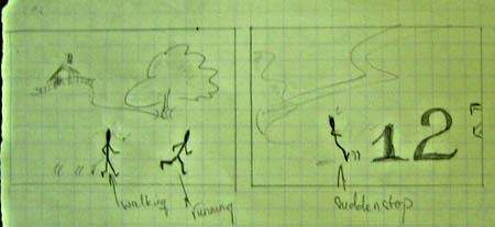
Sketching for my own flash ...
Uhm, I suddenly have idea for my own flash since two weeks ago, but that time I was too busy to sketch the storyboard.Therefore, today, I've drawn few pictures for my flash, and will finish it tomorrow.
There are a lot pictures, so I gather two frames in one file to reduce the file size.


There is a trouble with blogger so I lost all my description about my work; therefore I have to do it again.
1. I tend to choose different fonts for each number (as can be recognized from my sketch). That represent for the variety of things existing in the world.
2. The "1" stands for the beginning and "n" stands for an unknown destination,because usually we don't where the destination is.
3. The sudden appearance of the 3 dots again reveals unknown element; in this case, it's the time (how long we should spend to go to the destination).
4. The sudden appearance of "4" represents the obstacle which can easily occur in human life. Moreover, the different font of "4" from the other numbers express the various risk hidden.
5. I haven't decide the end of my flash, but maybe it will end up with happy ending. Whenever the man put enough effort, he can get the "n"( the destination) which is the present for his try. Otherwise, some new numbers continuously appear to prevent him from accessing the destination.
Saturday, December 1, 2007
Safe Sex research ...
After a short time surfing the Internet, I find some posters related to same sex

This poster was made for Thailand Campaign. I have not find much information related to the picture, but it's easy to realize the poster target to women and their shyness when using condom to protect themselves.Using monochromatic color scheme dedicatedly provides a clear view to the poster. The link among red items ( condom and text) are easily to realized. Personally, this picture doesn't impress me a lot, the design style is quite common without stressed point.The text is set in big size, and in a clear font so that viewer can read it easily. It's proper to say text plays an important role in this poster.

This poster is made for Thailand Campaign too, and again it seems to express information directly ( indeed, it's more obvious than the previous one). The link between danger and actions which cause risk are created through red color.Concerning about typography, it contains the same style as the above poster : clear, and big size font.Again, text cautions the message from the author to people.

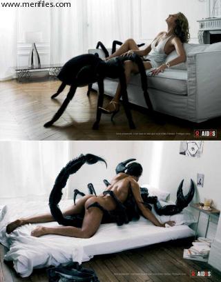
Yeah, the poster is completely different to the two previous ones. The greatest ads about safe sex I've ever seen.Look at the poster, who are the partners of the two guys? Yup, they're having sex with two poisonous insects: one is scorpion and one is spider. Those two insert are well-known as their risky, they can kill the target immediately just a few second after attacking.And unsafe sex is similar to their poison, one second without protection, people can destroy their lives.
In the opposite of the two posters above, text in this poster is small and places at the tiny conner. It's possible to say that the image is dedicated to impress viewer, while the text plays the supporting role .
I saw the poster before, and at that time, I was extremely shocked and impressed. However, the more impressive it is, the longer time it stands in viewers' mind ^^ .


UHm, here is two images from French ads. In those two images, the metaphor of bones (which means dead people) and unsafe sex is used. White is the dominance color and it provides a cold feeling to me. Uhm ... white of wall, white of human bones and white of everything else, that's such a frightened scene to everyone.
Similar to the previous one, those two poster focus on the impact of image, and text just plays a supporting role. It's really hard to read the phase "Be careful", because of its tiny size and lack of meaning impression in it.However, despite of small size, the picture of condom reveals all the purpose of the poster: using condom to get a safer sex.

This poster was made for Thailand Campaign. I have not find much information related to the picture, but it's easy to realize the poster target to women and their shyness when using condom to protect themselves.Using monochromatic color scheme dedicatedly provides a clear view to the poster. The link among red items ( condom and text) are easily to realized. Personally, this picture doesn't impress me a lot, the design style is quite common without stressed point.The text is set in big size, and in a clear font so that viewer can read it easily. It's proper to say text plays an important role in this poster.

This poster is made for Thailand Campaign too, and again it seems to express information directly ( indeed, it's more obvious than the previous one). The link between danger and actions which cause risk are created through red color.Concerning about typography, it contains the same style as the above poster : clear, and big size font.Again, text cautions the message from the author to people.
Yeah, the poster is completely different to the two previous ones. The greatest ads about safe sex I've ever seen.Look at the poster, who are the partners of the two guys? Yup, they're having sex with two poisonous insects: one is scorpion and one is spider. Those two insert are well-known as their risky, they can kill the target immediately just a few second after attacking.And unsafe sex is similar to their poison, one second without protection, people can destroy their lives.
In the opposite of the two posters above, text in this poster is small and places at the tiny conner. It's possible to say that the image is dedicated to impress viewer, while the text plays the supporting role .
I saw the poster before, and at that time, I was extremely shocked and impressed. However, the more impressive it is, the longer time it stands in viewers' mind ^^ .


UHm, here is two images from French ads. In those two images, the metaphor of bones (which means dead people) and unsafe sex is used. White is the dominance color and it provides a cold feeling to me. Uhm ... white of wall, white of human bones and white of everything else, that's such a frightened scene to everyone.
Similar to the previous one, those two poster focus on the impact of image, and text just plays a supporting role. It's really hard to read the phase "Be careful", because of its tiny size and lack of meaning impression in it.However, despite of small size, the picture of condom reveals all the purpose of the poster: using condom to get a safer sex.
Subscribe to:
Posts (Atom)