This time, I have to deal with poster and flier for Frisbee Club. Now, I come up with a draft version for the flier.
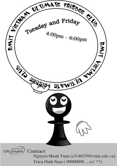
In the last semester, I created one pawn as the club's symbol. The reason why I chose pawn is its characteristic.Everybody knows pawn always move ahead (never turn back), it also presents the spirits of Frisbee players : never give up, always contribute 100% ability in game and fair-play.

(The pawn made in the last semester)
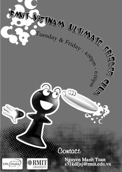
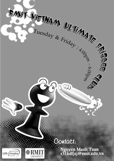
Now, for this time, I chose pawn and Frisbee disc again in the flier. Because of the lack color used in flier (only two colors: black and white), so it's absolutely a challenge for me (as it's the first time I design a flier).
About the design, The pawn jump up and try to catch the disc which is the most important equipment in Frisbee. He (the pawn) smiles to express how happy he is when he plays this game.Moreover, the gesture jumping up reveal the ambition to follow target of the player.
I chose to make one circle by the phrase " RMIT Ultimate Frisbee Club" in order to introduce the club and also the unity of this club.In addition, the character is strong and in capital, so that it reveals the strength and attracts viewers.
This is my first draft, however, I still feel there is a lack of one unique point related to Frisbee. As a result, I'll try to create one new decoration for the flier, but it maybe still bases on the idea of Pawn and Disc
-----------------------------------------------------------------------------------
Updated version of flier: I made a new version for the flier.Using the pawn and Disc, I want to emphasize the unique action in Frisbee : CATCHING DISC.
(Dark background)
(Lighter Background)
As can be seen, I create the disc flying way by text. There are three reasons for me to do this: 1. the two lines are the dominance over the whole picture, so people can easily find the essential information. 2. It provides the unique gesture (also the unique element in Frisbee) : catching disc .
The docs in the bottom of poster represent for the grass. Frisbee is played in grass field.