

This poster was made for Thailand Campaign. I have not find much information related to the picture, but it's easy to realize the poster target to women and their shyness when using condom to protect themselves.Using monochromatic color scheme dedicatedly provides a clear view to the poster. The link among red items ( condom and text) are easily to realized. Personally, this picture doesn't impress me a lot, the design style is quite common without stressed point.The text is set in big size, and in a clear font so that viewer can read it easily. It's proper to say text plays an important role in this poster.

This poster is made for Thailand Campaign too, and again it seems to express information directly ( indeed, it's more obvious than the previous one). The link between danger and actions which cause risk are created through red color.Concerning about typography, it contains the same style as the above poster : clear, and big size font.Again, text cautions the message from the author to people.
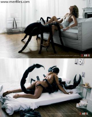
Yeah, the poster is completely different to the two previous ones. The greatest ads about safe sex I've ever seen.Look at the poster, who are the partners of the two guys? Yup, they're having sex with two poisonous insects: one is scorpion and one is spider. Those two insert are well-known as their risky, they can kill the target immediately just a few second after attacking.And unsafe sex is similar to their poison, one second without protection, people can destroy their lives.
In the opposite of the two posters above, text in this poster is small and places at the tiny conner. It's possible to say that the image is dedicated to impress viewer, while the text plays the supporting role .
I saw the poster before, and at that time, I was extremely shocked and impressed. However, the more impressive it is, the longer time it stands in viewers' mind ^^ .


UHm, here is two images from French ads. In those two images, the metaphor of bones (which means dead people) and unsafe sex is used. White is the dominance color and it provides a cold feeling to me. Uhm ... white of wall, white of human bones and white of everything else, that's such a frightened scene to everyone.
Similar to the previous one, those two poster focus on the impact of image, and text just plays a supporting role. It's really hard to read the phase "Be careful", because of its tiny size and lack of meaning impression in it.However, despite of small size, the picture of condom reveals all the purpose of the poster: using condom to get a safer sex.
No comments:
Post a Comment